

Adding The Finshing Touches To Get the Perfect Place: How to create a home.
Hello Lovelies,

Muriel Cibot's cute little nook she uses as a home office. Notice the egg-shaped desk lamp, the lovely dark grey desk and the custom-made woof shelving behind desk. That chair is good-looking, but probably not very comfortable, though...
Two days ago, I gave you a small glimpse at Muriel Cibot's place in Paris. She is a French interior decorator. The photo I posted of her living-room was OK-ish but might seem bland. A bit minimal and yes, bare. something was missing. I'd say, the finisqhing touches, such as a rug under the sofa, some extra sitting beside said narrow sofa, artwork that is actually hung on the walls, extra shelves for storage, and draperies around the windows.
 "le journal de la maison" - the cover. via
The good news is; Muriel Cibot recently did just all of that! In the latest issue of "Le journal de la maison", a French decor mag, we can see (and enjoy) how the finishing touches, especially the use of textiles, can add warmth and depth to a place than can now be rightfully called "home".
Last but not least, her living-room displays one my fave color scheme, the contrast between bright yellow and soft grey.
And now it is time that I scan at least one page from "Le journal de la maison" for you to see.... Stay tuned!
I apologize foe the very red photos below (sorry, bad lighting) - will rescan those asap:
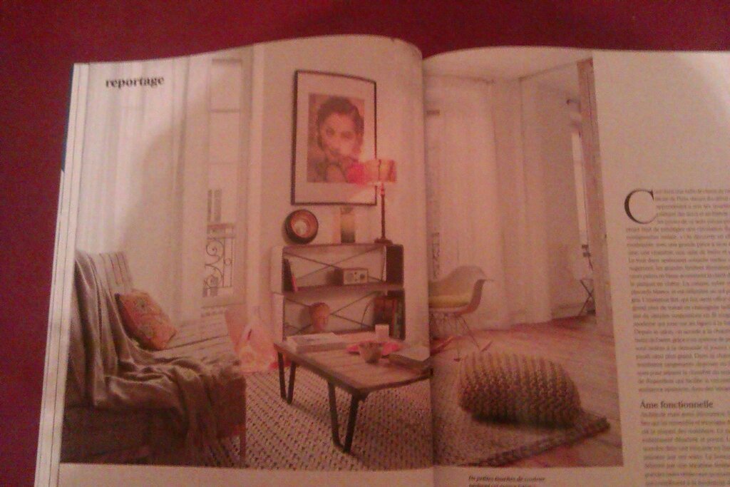
This is a view of Muriel's living-room. Notice the art finally hung on the wall? The pillow and throw on sofa, adding softness? The great rug and knitted pouf? Sheer draperies on windows and two modern shelves stacked one on top of the other. Swon!
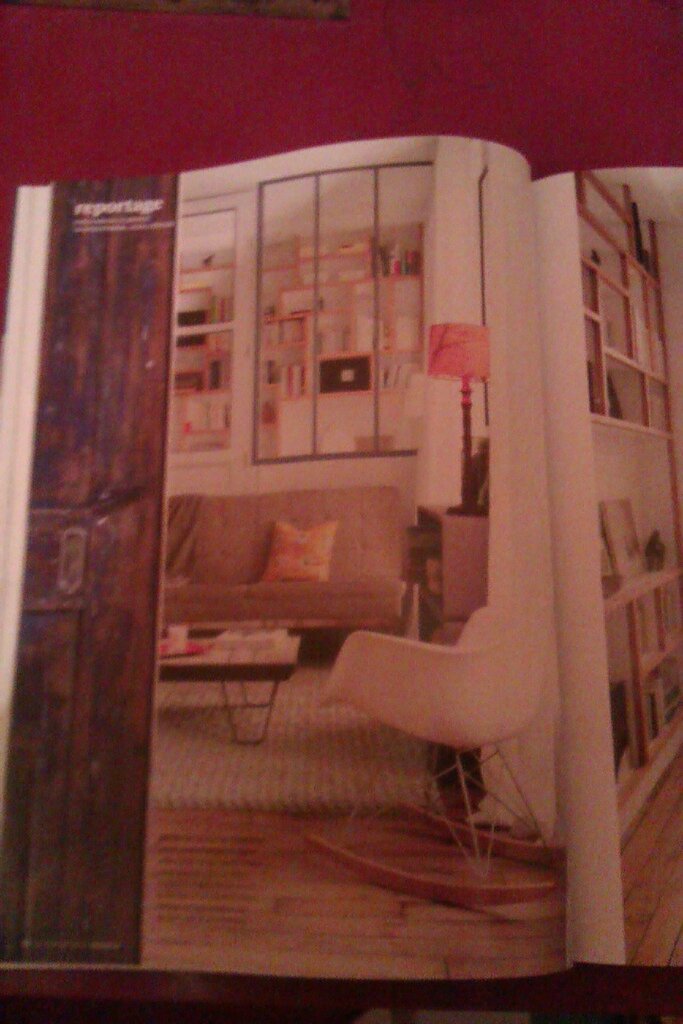
Another view of living room, with sliding door made of reclaimed wood. Also, the lampshade and the window treatment echo eaxh other with a silimar pattern of bare branches:
One thing, though, I don't like her bedroom, either in the 2011 or 2013 version. Something's missing. And the Jieldé vintage lamps on either side of the bed are too big for the space and are visually aggressive. I do love Jieldé lamps in other settings, though.
Her bathroom is not photographed in the 2013 version. In the 2011, we see very little of it. It looks, white, very clean, inviting, OK-ish, but not so special.
Maybe Muriel should do something about that! ;-)
Final note: Muriel has a lovely open kitchen. Will add a photo soon, with a better quality i promise.
See also: AT's "Love Where You Live: 4 Ways to Make the Most of Your Rental" by Apartment Therapy.
-Beautymist


/http%3A%2F%2F4.bp.blogspot.com%2F-4yuuDwrwKl8%2FWIXbZXxeQgI%2FAAAAAAAAAk0%2FJX9ouMC42EQqUDOn2ufja-3Ugzoh_8cfwCLcB%2Fs320%2Fneige.gif)
/http%3A%2F%2Fstorage.canalblog.com%2F62%2F60%2F75231%2F85788870_o.jpg)
/http%3A%2F%2Fstorage.canalblog.com%2F00%2F23%2F75231%2F50955767_o.jpg)
/http%3A%2F%2Fstorage.canalblog.com%2F67%2F51%2F75231%2F49560857_o.jpg)